Low monitor contrast can make your screen appear washed out, dull, and difficult to read. When the difference between the darkest blacks and the brightest whites is insufficient, text becomes harder to distinguish from the background, and images lose their depth. Whether you are a casual user or a website owner concerned about accessibility, understanding how to adjust your display settings is essential for visual comfort.
Understanding Contrast and Brightness
Before making adjustments, it is important to distinguish between brightness and contrast. Brightness, often labeled as luminance, controls the overall intensity of the backlight. Contrast, on the other hand, adjusts the ratio between the darkest and lightest parts of the image. If your screen looks greyish or faded, increasing the contrast is usually the correct first step.
Steps to Improve Monitor Contrast
You can resolve low contrast issues by following these systematic steps:
- Check Physical Monitor Settings: Use the buttons on your monitor to access the OSD (On-Screen Display) menu. Look for the contrast setting and increase it incrementally. Avoid setting it to the maximum, as this can cause clipping, where details in bright areas are lost.
- Adjust Graphics Card Settings: If the monitor settings are insufficient, use your computer’s software. For Windows, navigate to the Display Settings or the control panel provided by your graphics card manufacturer (e.g., NVIDIA Control Panel or Intel Graphics Command Center).
- Calibrate Your Display: Use built-in calibration tools. In Windows, search for “Calibrate display color” to follow a guided wizard that helps balance gamma, brightness, and contrast.
- Update Display Drivers: Outdated drivers can sometimes cause color profiles to malfunction, leading to poor contrast. Visit the manufacturer’s website to download the latest versions.
Comparison of Display Technologies
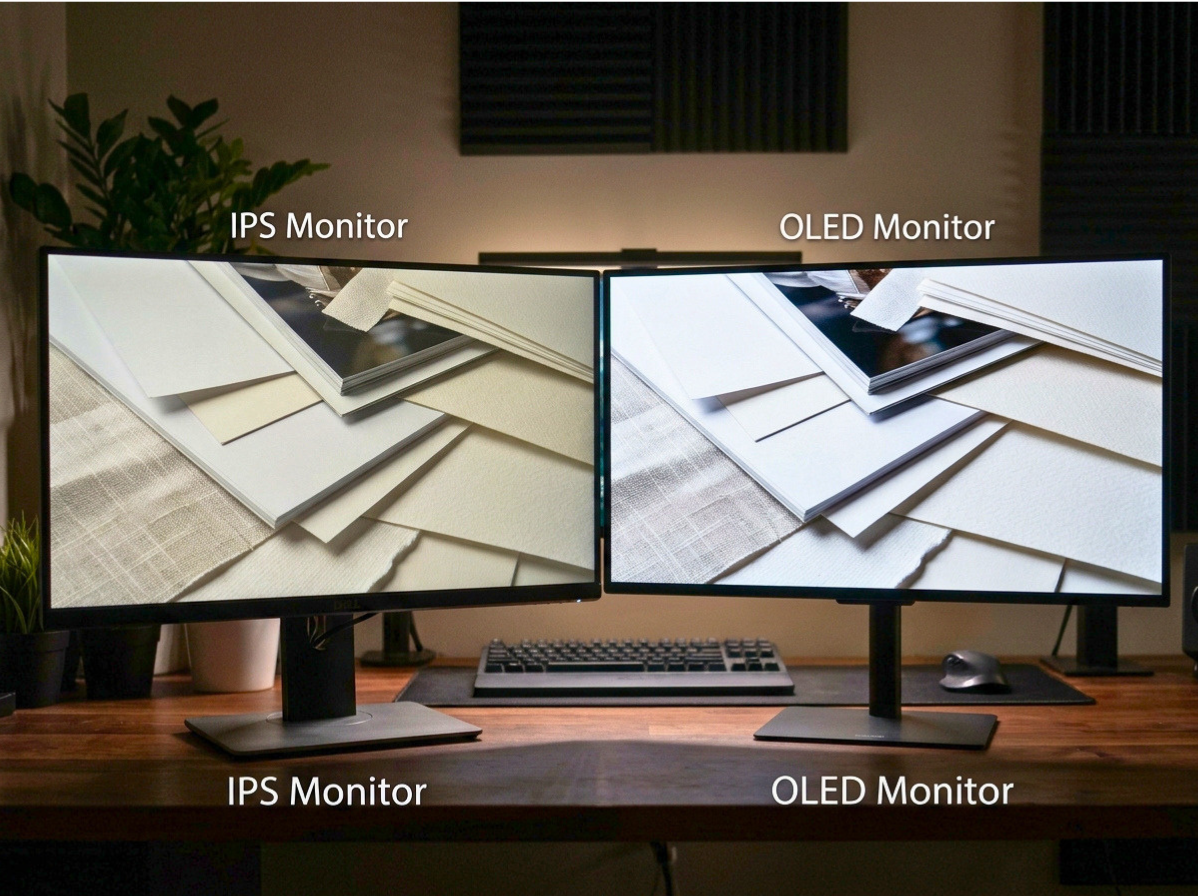
The type of monitor you use significantly impacts how contrast is perceived. The following table outlines the typical contrast performance of common display technologies:
| Display Type | Typical Contrast Ratio | Best For |
|---|---|---|
| IPS (In-Plane Switching) | 1000:1 | Color accuracy and viewing angles |
| VA (Vertical Alignment) | 3000:1 to 5000:1 | Deep blacks and high contrast |
| OLED (Organic LED) | Infinite | Perfect blacks and vibrant colors |
Considerations for Website Owners
If you own a website, you must ensure that your content remains readable for users with various monitor setups. Low contrast in your design can lead to poor accessibility scores and frustrated visitors. Follow these guidelines to maintain high contrast standards:
- Use High-Contrast Text: Ensure there is a significant difference between your text color and background color.
- Test with Accessibility Tools: Use tools like the WebAIM Contrast Checker to ensure your color combinations meet WCAG (Web Content Accessibility Guidelines) requirements.
- Avoid Light Grey Text: While aesthetically pleasing to some, light grey text on a white background is a common cause of readability complaints.
Limitations and Cautions
While increasing contrast can improve clarity, it is not a universal fix. If your monitor is an older TN (Twisted Nematic) panel, it may have inherent limitations regarding contrast that software cannot fully overcome. Furthermore, setting contrast too high can lead to eye strain during prolonged use. Always aim for a balanced setting that allows you to see fine details without the image appearing harsh or unnatural.
Conclusion
Low monitor contrast is often a result of misconfigured settings or hardware limitations. By adjusting your OSD menus, utilizing graphics card software, and ensuring your website design adheres to accessibility standards, you can significantly improve your visual experience. If these steps fail to produce a satisfactory image, it may be time to consider a hardware upgrade to a panel type better suited for high-contrast viewing.