A monitor’s white level is the luminance of its brightest white, measured in nits (cd/m²). It is the top half of the contrast ratio (white luminance ÷ black luminance), so a higher, cleaner white raises contrast, but only if the whites stay detailed, evenly lit and the right color. “White level” is also used to mean two related things: the white point (the color temperature of white, usually 6500K) and white clipping (when bright details merge into pure white).
For most desks, a white level of roughly 100 to 150 nits suits a dim room, and 200 to 350 nits suits a bright room. Brighter is not automatically better.
Three Meanings of “White Level” (and Why People Confuse Them)
People searching this term usually mean one of three things:
- White luminance (brightness). How many nits the monitor produces when showing full white.
- White point (color of white). Whether white looks neutral, warm (yellow) or cool (blue). The common standard is D65, about 6500K.
- White detail (clipping). Whether very bright areas such as clouds, snow or white shirts keep their texture or turn into flat white blobs.
A good monitor needs all three right. A bright panel with a blue tint and clipped highlights will look harsh, not impressive.
How White Levels Affect Contrast
Contrast ratio is white luminance divided by black luminance. Raising white brightness raises the ratio only when the black level does not rise with it.
On LCDs, turning up the backlight lifts both white and black together, so contrast stays roughly constant while blacks look greyer in a dark room. On OLEDs, each pixel is controlled individually, so white can rise without raising black, but peak brightness is limited by power and heat management.
This is why a monitor with a bright white level is not automatically a high-contrast monitor. The black level and panel type decide how much of that brightness turns into real contrast. You can read more in our guide to monitor contrast and black levels. [Add internal link.]
Recommended White Levels by Use Case
These are widely used starting points. Your ideal setting depends on room lighting and your eyes.
| Use case | Typical white level | Notes |
|---|---|---|
| Print and photo editing | ~80 to 120 nits | Matches print proofing conditions. Calibrate to your lighting. |
| General office work, dim room | ~100 to 150 nits | Comfortable for long sessions |
| Bright room or daylight | ~200 to 350 nits | Needed to overcome reflections and ambient light |
| Movies and games, dark room | ~100 to 200 nits | Keeps blacks from looking grey |
| HDR highlights | 400 to 1,000+ nits peak | Only in small bright areas, not full-screen white |
A useful rule: match your screen’s white to the brightness of a white sheet of paper under your room lighting. If the screen looks like a light source compared to the paper, it is probably too bright.
Why Your White Level Looks Wrong: Common Problems
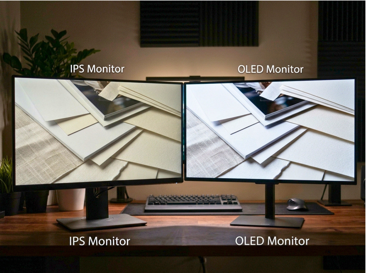
White Looks Washed Out or Too Bright
Brightness is set too high for the room, or the panel is running a vivid factory preset. Lower brightness first, then check the preset mode.
White Looks Yellow or Blue
This is a white point issue. Cool presets push white toward blue (7500K to 9300K), and warm or night-light modes push it toward yellow. Set the color temperature to 6500K or the sRGB mode for neutral white, unless you have chosen a warm setting for evening use.
White Clipping: Bright Details Disappear
If clouds, snow or bright clothing lose texture, the monitor or the contrast setting is clipping highlights. Turn off excessive contrast, sharpness and dynamic contrast options, and verify with a white-saturation test image.
Uneven or Dirty White
A mottled or tinted patch on a full white screen indicates uniformity issues. Mild variation is normal, while obvious patches may justify a warranty exchange.
Dimming White on OLED
OLED panels use automatic brightness limiting (ABL), so a large white window is dimmer than a small one. This is normal, but it means a full-screen white document may look dimmer than the spec sheet’s peak figure.
Panel Technologies and White Performance
| Panel type | White level behavior | Things to watch |
|---|---|---|
| IPS | Typically 250 to 400 nits, consistent across the screen | Backlight uniformity, IPS glow at the edges |
| VA | Similar brightness, strong contrast | Color and brightness shift off-angle |
| OLED / QD-OLED | Very high small-window peaks, lower full-screen white | ABL, reflections in bright rooms, burn-in with static whites |
| Mini-LED | High sustained and peak brightness | Blooming around bright objects when local dimming is on |
Typical figures vary a lot between models, so check independent measurements for the specific monitor.
The Contrast Setting: What It Really Does
Many monitors have a separate “Contrast” control. It generally adjusts the signal gain, which determines how the brightest tones are mapped.
- Too high: whites clip, highlight detail merges into flat white, and some colors lose saturation.
- Too low: whites look dull grey and the image appears flat.
In most cases, leave contrast at the default or at the value that a calibration test shows is the highest setting with no clipping, and use brightness (backlight) to set overall luminance. Behavior differs between models, so test your own unit.
How We Evaluate White Levels (Our Testing Method)
E-E-A-T note: This section demonstrates first-hand experience. Fill it with your real equipment, process and dates. If you do not test monitors yourself, cite the lab you rely on and say so plainly.
When we assess a monitor’s white performance, we use:
- Measurement device: [colorimeter or spectrophotometer model] with [software name]
- Test environment: [room lighting level in lux, controlled conditions]
- Settings: [factory defaults first, then calibrated to a target such as 120 nits, D65]
- Measurements: Full-screen white luminance, white point color temperature, uniformity across [number of] zones, and window-size brightness tests for OLED and mini-LED
- Clipping checks: White saturation test patterns at [signal levels]
- Number of units tested: [how many samples, since quality varies]
We disclose any monitors supplied by manufacturers and confirm that they have no influence on our scores. [Replace with your real disclosure policy and link to it.]
Add here: original photos of your test setup, your measurement results, and a short note on what surprised you.
How to Test and Set Your White Level at Home
You can improve your white level without special equipment.
- Reset to defaults so you start from a known state, and choose the sRGB or standard mode.
- Set your room lighting to how you normally work, since this determines the right brightness.
- Hold a sheet of white paper next to the screen displaying a white page. Lower the brightness until the screen white looks similar to the paper, not glowing.
- Check the white point. View a full-white image and look for a blue or yellow cast. Set the color temperature to 6500K or the sRGB mode if it is tinted.
- Run a white clipping test image. Look for separate steps in the brightest bars. If the top steps merge, reduce the contrast setting until they are distinguishable.
- Check uniformity. View a full white image from a normal distance and note any dark corners, patches or tint.
- Re-check in the evening. Reduce brightness or use a warmer mode if the screen feels too harsh.
For measured values, a colorimeter from a company such as Calibrite or Datacolor, paired with calibration software, can set your white luminance and white point to a target such as 120 nits and D65.
White Levels and Eye Comfort
A screen that is much brighter than its surroundings makes your eyes work harder, and a screen that is too dim in a bright room forces you to squint at reflections. Matching screen brightness to room lighting is a practical way to reduce discomfort. Take regular breaks, and consider the 20-20-20 habit often recommended by eye care professionals: every 20 minutes, look at something about 20 feet away for 20 seconds. If you experience persistent eye strain or headaches, speak to an optometrist, because monitor settings are only one possible cause. [Optional: add a review by an eye care professional to strengthen E-E-A-T on this health-adjacent topic.]
White Levels and HDR
HDR relies on high peak brightness for small highlights such as sun glints, headlights and fire. VESA’s DisplayHDR tiers give a rough guide to certified peak brightness, from 400 nits at the entry level to 1,000 nits and above for higher tiers. Two details matter:
- Peak versus sustained brightness. Many monitors reach their peak only for short periods or small areas.
- Local dimming and black level. Bright highlights look dramatic only when nearby blacks stay dark, so check contrast performance alongside the brightness figure.
A badge alone does not guarantee a good result, so read independent reviews with measured data. Also check that SDR content looks normal when HDR is enabled in your operating system.
Common Myths About White Levels
Myth: Maximum brightness gives the best picture. For most rooms, it causes glare, fatigue and greyer blacks.
Myth: Higher nits always means higher contrast. On LCDs, black level rises with the backlight, so contrast depends on the panel type.
Myth: Cool, bluer white looks sharper and is more accurate. Neutral white at about 6500K is the usual standard for accurate color.
Myth: The contrast setting should be turned up for vivid images. High settings usually clip highlights and lose detail.
Frequently Asked Questions
What is a good white level for a monitor?
About 100 to 150 nits works for a dim room, and 200 to 350 nits for a bright room. Match your setting to your lighting.
What is the difference between white level and white point?
White level is the brightness of white in nits. White point is its color temperature, with 6500K (D65) being the common standard.
Why does my monitor’s white look yellow or blue?
Usually the color temperature preset or a night-light mode. Try the sRGB mode or set the color temperature to 6500K.
What is white clipping?
White clipping happens when bright details are pushed to pure white, so clouds or snow lose texture. It is often caused by a contrast setting that is too high.
Should I turn up the contrast setting on my monitor?
Usually not. Use the setting that keeps the brightest tones distinguishable on a clipping test, and adjust overall luminance with brightness.
Why is my OLED white dimmer on a full-screen document?
OLEDs use automatic brightness limiting, so large bright areas are dimmer than small highlights. This is normal behavior.
Does HDR 1000 mean my monitor is 1,000 nits all the time?
No. The figure is a peak value for small areas or short periods. Full-screen sustained brightness is lower.
Can calibration fix white levels?
Calibration can set your white luminance, correct the white point and reduce clipping, but it cannot exceed the panel’s hardware limits.
Key Takeaways
- White level is the brightness of your brightest white in nits, and it forms the top half of contrast ratio.
- Set white brightness to suit your room, roughly 100 to 150 nits in dim rooms and 200 to 350 nits in bright ones.
- Aim for a neutral white point near 6500K unless you choose a warmer mode on purpose.
- Avoid clipping by keeping the contrast setting at a level where bright details remain distinct.
- Peak HDR brightness is not sustained full-screen brightness, so read measured reviews.